1stwebdesigner |

| Media Queries Tutorial – Convert Burnstudio into a Responsive Website Posted: 27 Sep 2012 06:00 AM PDT Howdy Folks! If you’re following the series, we have converted Burnstudio Design Agency from PSD to working HTML/CSS. We have discussed how we will markup the HTML and how we will style it using CSS. Now, in this tutorial I will teach you how to make it Responsive by using Media Queries. Media Queries will change the look of the website depending on the screen resolution of the device: desktop to a mobile resolution by tweaking the CSS for a variety of viewports. By the end of this media queries tutorial you will learn how to convert any website into a responsive website. Let’s get started!
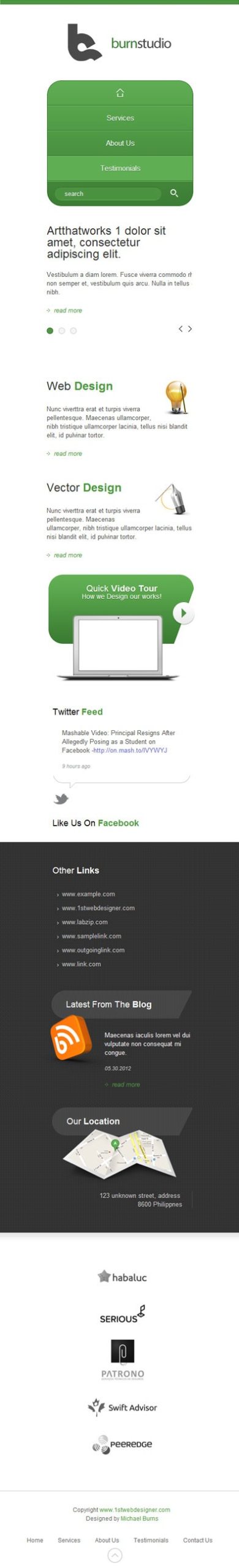
Demo | DownloadStep 1: PreparationMake sure that you followed the previous tutorial where we converted a PSD file into a working HTML/CSS website. Before anything else I want to point out that we need to design how it will look based on our existing design for a different viewport, in this case for a mobile device that has a max-width of 320px.
Click to see full preview. In the image above you can see the elements are the same but I styled it in a way that will suit the 320px width of a mobile version. For this tutorial we will not tackle the design process, we will jump into coding directly. Don’t worry, in my upcoming tutorial I will teach you how to design for the responsive web. Lastly, of course you still need your favorite code editor, debugging tools and lastly the web browser where we can view our coded layout. Step 2: Getting Files ReadyMake sure you open up the HTML file and the CSS file in your text editor and we’re ready to go. Step 3: Adding Meta Tag<meta name="viewport" content="width=device-width, initial-scale=1, maximum-scale=1"> This will take control of the layout on mobile browsers. Place this inside the tag and you’re ready to go. Step 4: Working < 960 Viewport
This is how our layout will look on screens with a width of 960px and below. @media only screen and (max-width: 960px){ styling goes here } This is our first media query that will target screens less than 960px. Now let's add the CSS styling as follows: /* VIEWPORT < 960px */ @media only screen and (max-width: 960px){ header, nav, #slides, #service, #widget, #media, #client, footer, #container{ width: 768px; } .slide-right{ left: 0; } .slide-heading{ width: auto; height: auto; padding: 0; margin: 0 0 20px 0; background-image: none; color: #333; } .slides_container div img{ display: none; } .slide-right .info{ width: 768px; margin-bottom: 20px; margin-left: 0; } .slide-right .readmore{ margin-left: 0; } .slides_container{ height: 200px; } a.next{ right: 0px; } a.prev{ right: 25px; } .pagination{ left: 0; } #service{ background: none; height: auto; } #vector{ padding-left: 0; width: 369px; } #vector img{ margin-right: 0; } #web{ padding-left: 0; width: 369px; } #web img{ margin-right: 0; } #facebook{ display: none; } #twitter{ margin-left: 18px; } #blog{ clear: both; } #links{ width: auto; margin-bottom: 30px; } #links ul li{ float: left; margin-right: 30px; } } Since our layout is now less than 960px, we will style all the main container elements by changing the width to 768px. Next is the slider area, notice that we have a heading with a class of slide-heading, a div with a class of slide-right which contains the information and read more. We need to change the style of this by removing the background of the heading and changing the fixed width/height to auto, zero out the padding, add a 20px margin, and lastly change the color to a dark gray. For the img that displays on our slider we will hide it by changing the display to none. For the slide-right .info .readmore we will zero out the left margin to push it back to the left, also for the .info let’s change the width to 768px and add a 20px bottom margin. For the slider controls let’s just move the next to right by change the right value to 0px, for the prev change the value to 25px. Lastly, for the pagination change the left value to 0px. Moving on to the service section. When we’re coding the service section we forgot to add a group class to it’s parent container, we already know the function of the group class so no need to explain. For the CSS styling we will just remove the background and change the height value to auto. <div id="service" class="group"> Inside of our service section we have vector and web that we styled by default by giving a padding of left 30px, let’s zero it out and change the width to 369px. Lastly, for the vector img and web img let’s change the margin right to zero. In the media section since we don’t have enough space here let’s just hide facebook by changing the display to none. Maybe you’re wondering why hide it? Well, I know we should find a way to make everything responsive, but based on what I have read from other blogs ,sometimes we need to remove/hide some elements due to lack of space, just like some other responsive sites, they remove a couple of links in their main navigation. In widget section the only thing we need to change is the links, let’s change the default width to auto, then by floating the li elements to left and adding a 30px margin to right. Step 5: Working < 768 Viewport
@media only screen and (max-width: 768px){ styling goes here } The above CSS is our second media query that will target screens less than 768px (Tablet Portrait). Now let's add the CSS Styling as follows: /* VIEWPORT < 768px */ @media only screen and (max-width: 768px){ header, nav, #slides, #service, #widget, #media, #client, footer, #container{ width: 524px; } nav ul li.last{ display: none; } .slides_container{ height: 250px; } .slide-right .info{ width: 524px; } #web{ width: 100%; margin-bottom: 30px; } #web img{ padding-left: 20px; } #vector{ width: 100%; } #vector img{ padding-left: 20px; } #service{ height: auto; } #video{ margin: 0 auto 30px auto; float: none; } #twitter, #facebook{ float: none; margin: 0 auto; margin-bottom: 30px; } #facebook{ display: block; } #links{ width: 285px; float: none; margin: 0 auto; } #links ul li{ width: 285px } #blog{ float: none; margin: 30px auto; } #location{ float: none; margin: 0 auto; } #client ul li{ width: 100%; float: none; margin: 30px 0; } #footer-left{ width: 100%; margin-bottom: 30px; } #footer-left p{ text-align: center; } #footer-right{ float: none; width: 100%; margin-bottom: 30px; } #footer-right ul{ float: none; width: 75%; margin: 0 auto; } } The first step is similar to what we did in the previous one. Let’s change the width of the main containers to 524px. Now that we are on a smaller viewport, which is less than 768px, our search bar will fall down the navigation. So for a quick solution let’s just hide it for now. In slider area let’s decrease the height of the container to 250px and change the width of .info to 524px. In web and vector section let’s change the width to 100% to fill up the whole space and by giving the web a 30px bottom margin to give space. In media section by default our video div is floated to left let’s change it to none, position in to center, and add we will add a 30px bottom margin. For twitter and Facebook still the same float to none, position to center, add a 30px bottom margin and lastly let’s reveal the Facebook again by changing the display to block. In widget section we will position everything to the center, so we will give the links a fixed width of 285px, change the float to none and add a margin 0 auto to position it to the center, also for the li element change the width to 285px. Now that we have the links in position let’s position the blog and location by doing the same step. In client section by default we give it 10% width to equally divide and position the images correctly, now let’s change it to 100% and add a 30px bottom margin. In footer section let’s give a 100% width to footer-left and footer-right. In footer-left we will position the text to center by simply adding text-align to center. For the footer links we need to add a class of group again to it’s container which is footer-right. <div id="footer-right" class="group"> Now that we added the class let’s change the float to none and add a 30px bottom margin. Lastly, we will change the width to 75% and give it a margin 0 auto to position to center. Step 6: Working < 524 Viewport
@media only screen and (max-width: 524px){ styling goes here } This is our third media query that will target screens less than 524px (Mobile). Now let's add the CSS Styling as follows: /* VIEWPORT < 524px */ @media only screen and (max-width: 524px){ header, nav, #slides, #service, #widget, #media, #client, footer, #container{ width: 300px; } header h2 a{ width: 100%; background-position: center top; } nav{ height: auto; } nav ul li{ float: none; border: none; border-bottom: 1px solid #336c2b; border-top: 1px solid #78c368; } nav ul li.home{ border-top: none; } nav ul li.last{ display: block; border-bottom: none; width: 100%; margin: 0; } nav ul li.last div{ margin-left: 15px; } nav ul li a{ text-align: center; } nav ul li.home a:hover{ -webkit-border-top-left-radius: 30px; -webkit-border-top-right-radius: 30px; -webkit-border-bottom-left-radius: 0; border-top-left-radius: 30px; border-top-right-radius: 30px; border-bottom-left-radius: 0; background: #5fae53 url(images/home.png) no-repeat 50% 50%; } #call{ display: none; } .slides_container{ height: 270px; } .slide-heading{ width: 300px; } .slide-right .info{ width: 300px; } #web img{ width: 64px; height: 72px; } #vector img{ width: 76px; height: 69px; } #service{ height: auto; } #footer-right ul{ float: none; width: 285px; margin: 0 auto; } #footer-right ul li{ float: none; margin: 0; } #footer-right ul li a{ padding: 8px 0; } } Now we’re getting to a smaller viewport which is for mobile devices. First thing to change is the main containers: change the width to 300px. Next we will hide the call div by adding a display to none. For our logo let’s position it to center by giving it a width of 100% and by adding a background-position center top. In nav part let’s make the navigation styled vertically to perfectly suit a smaller viewport. First, let’s give the nav of height of auto, unfloat the li elements, border to none since we have a border-left and right by default, then overwrite the style by adding again a border-bottom and top. Now we will remove the border-top for .home and border-bottom for .last, also we will display the search bar again by applying a display block to .last also give it 100% width and 0 out the margin. To position the search bar correctly apply a 15px margin to the left on li.last div. Now let’s position the text to center by applying text-align center. Next, we will change the border-radius to top-left and top-right when we hover to .home. In slider section let’s just change the width of the container to 270px and for the .slide-heading and .info change the width to 300px. In service section let’s change the width and height of the image for web and vector, lastly give the service div a height of auto. Lastly we will style the footer links by changing the float to none, give it a width of 285px and position it to center. For li elements change the float also to none and 0 out the margin, lastly give the a element a 8px top and bottom padding. We're done, Finally!And there you go, we just turned an HTML layout into a responsive one. How was the tutorial? I hope you learned something from this tutorial. If you have some techniques, comments, and suggestions please share them below! If you liked this tutorial kindly share it with your friends. Thanks! :) |


| You are subscribed to email updates from 1stwebdesigner To stop receiving these emails, you may unsubscribe now. | Email delivery powered by Google |
| Google Inc., 20 West Kinzie, Chicago IL USA 60610 | |
Niciun comentariu:
Trimiteți un comentariu