Orphicpixel |

- The Pitfalls of Template Based Design in your Professional Image
- Top 5 Best Tools for Graphic Designers
- 12 Typography-Based Print Ads
| The Pitfalls of Template Based Design in your Professional Image Posted: 19 Jun 2012 02:00 PM PDT The importance of image cannot be understated. A good image can be the link you need to succeed, where a poor one can sometimes never be overcome. In the world of business—particularly in the twenty-first century—there is a multitude of ways through which first impressions can be made. Traditional meet and greets are still relevant, but in this fast paced world of technology and ecommerce, faces and names can fall short without a strong image to support them. Web presence, signage, and—thankfully—traditional business cards work wonders to carry your professional image. However, the race to stay on top now relies on your capacity to stand out within these platforms, and not fall to the bottom of the stack. The ability to stand out rests on the visual appearance of these entities, and this visual appearance requires a design that will set you apart. When chasing image, there are typically two ways to go: template based or custom design. The direction a business choses to take in this respect has a great deal to do with finances; however, the belief is that template based design—for any aspect of your professional image—is detrimental to you and your business.
The principle issue with template designs is they are a dime a dozen. If you find a design you like, chances are a few thousand other people have as well. This exact thing happened to me when I printed my first set of cards. The business card is your ticket in the door. It is your personal and physical impression, which links you with what you do. It is also the only part of your image the receiver will take home with him, and—with any luck—they will put it in their card index and not in the trash. I printed using the FedEx kiosk in the local copy shop, using a design that I found very classic and unique. At my first meet-n-greet for the local small business owners association, five other people were handing out the exact same card as me. No one remembered my name or my business that night, and I did not get a single call from that event. The inexpensive template cards ended up costing me more in the long run, because I knew I had to toss them in order to avoid such a thing happening again.
Template designs become faceless in the crowd of other businesses also using the same design. With a good deal of additional customization, a template can work, though the cost and time of this begs the question: why didn't you just go custom to begin with? We live in a digital age, and curb appeal now exists in the cyber realm. When prospective clients' and customers' hit your site, their first impression of you and the sort of business you perform is based on this cyber curb appeal. If they are not sold on you within the first few seconds, they will not stay, regardless of what you actually have to say. Template web designs are often very limited in function, with only a few menu tabs available. The minimal stock image library will also prove to be a hindrance to your brand's appearance. Your initial appearance needs to make you stand out in a way that wows the visitor enough to stay regardless of your service, and this can never be achieved with a template that keeps you looking like everyone else.
Apart from getting lost in the crowd, a bland template can tell a prospective client or associate that you lack creativity, and possibly do not care about your image. This sounds harsh, but look at it from their end; your business should be the most important thing you have going on right now, and if you are willing to cut corners on something as important as image, where else will you be willing to cut corners in terms of your business dealings? It's a question of how badly do you want your clients to think you care. Granted, if you are just starting to get moving, plan to create a custom design in the near future, a simple card design might be your best option for the time being; however, if would still be a good idea try and customize it a bit on your own, and keep it minimal. This is not the image your brand will carry forever, but add just enough to make you stand out from the others. The image you chose to define your business and professional entity is one that you will want to make as timeless as possible. Revamping your image later down the road can be as dramatic and challenging as changing name or ownership. The design elements in your brand are things you will want to take your time with. Often, the process of custom design will help get you exactly where you want to be, and the time it may take will really help you connect with your image. The results will be something to be proud of, and an image you will be pleased to have define your business for years down the road.
|
| Top 5 Best Tools for Graphic Designers Posted: 19 Jun 2012 04:00 AM PDT The field of graphic design is booming. As design is showing up in more and more places, including the on the web, more people are entering the field and more new tools are being produced. Some of these tools are better than the others, far and away, and these can allow you to do higher quality work with greater ease, giving you an edge over the competition. With so many graphic design tools on the market, it can be hard to determine which are truly the best, but this list is designed to help. The following are the top 5 best tools for graphic designers, and hopefully this can help you find the ideal tools for you. 1.) Adobe Photoshop
You may be rolling your eyes and groaning now, as for many, Photoshop on this list is essential. The industry standard software, it is powerful and versatile, letting you do more than you can with any competitor (if you can even call them that). That being said, new designers and those trying to start getting into design may think that a free or low cost image rendering program may be enough, but if you are or want to be a professional, these simply will not cut it. You should consider scooping up the entire Adobe Creative Suite to be a real pro. 2.) WhatTheFont!
This website could prove to be indispensable, particularly for designers brought on to finish a project or to build off of existing design work. With this web-based application, you simply need to upload an image or input a URL, and WhatTheFont! should be able to tell you what font you submitted after analysis. Not every font will be in their database, but this helpful tool may just find a font that is close enough to create a smooth, seamless product for the client. 3.) Dropbox
There are many online backup services. A sharing-based service may work for you, such as Dropbox, but another cloud may be more your speed. It is always important to backup your work, but as a designer, you are also backing up your paycheck. An online service is better than a local back up; it offers you more protection in the event of a catastrophic, physical emergency like a fire. Also, if when you are already using Dropbox or another like service, it is easier to get your renderings and final design ideas to your clients. To protect your work, however, having a local backup as well is probably a good idea. 4.) Lorem Ipsum Generator
As a designer, you are aware that dummy text in Latin is the industry standard when presenting new templates and design ideas in a mock-up. This practice makes it easy for you and your client to image what it will look like with actual content. Some designers will seek out this faux-content from other sources and copy and paste it onto their own work, but that can take a long time. To do this quickly and with ease, you should use the Lorem Ipsum Generator, an add-on for Google Chrome. 5.) Blender 3D
3D everything is big right now, and many people are searching to see 3D graphics on everything from their websites to their business cards. Blender 3D can help you do that. An open source program, it is a good free way for you to start working with 3D. Easy to use, this software comes with many useful features that allow designers to create professional, and maybe even like-like, graphics rendered in 3D. This is definitely not the only tool out there for making 3D graphics, but at the price-point it is a fantastic tool for you to get started with .
|
| Posted: 19 Jun 2012 01:47 AM PDT Whether you’re in need of a fresh look yourself or simply appreciate the beauty of the written word, check out these 12 typography-based print ads: 1. Graffiti Sells
This beautiful poster combines the stylish art of graffiti with eye-catching drawings to get its message across in a hip and attractive way. 2. Handwriting, Printed
No matter how digital we become, the allure and attractiveness of the handwritten word still holds appeal as is evidenced by how often it is found in marketing print and this website advertisement serves as an excellent example of the uniqueness that can be achieved when old methods meet new methods. 3. Green Typography
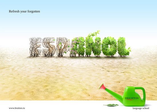
Green fever continues to grip much of the world’s population and the creators of this ad have obviously taken notice, using digitally-tweaked natural landscaping to do its talking for it. 4. Layers & Layers
Whether you give the credit for its fresh look to the textured background or the typography itself, there is no denying the great look of this fun layered ad. 5. Crafty Typography
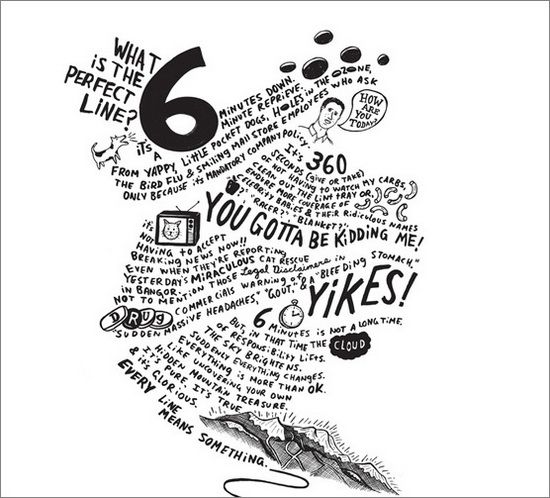
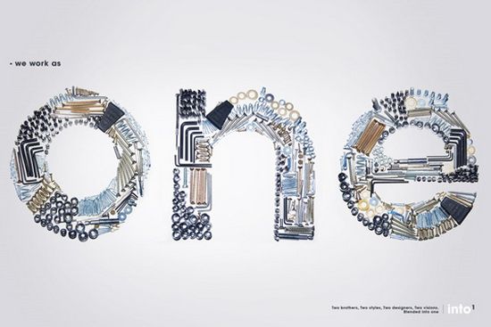
The use of crafty tools in order to create its commanding message gives this ad a look of busyness that is belied by its open spaces, allowing the viewer to focus on its message while the natural feel of the ad is quietly conveyed subconsciously. 6. Freestye & Artsy
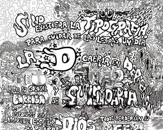
Obviously drawn by hand, this beautiful poster is another great and very memorable example of what can be achieved when visual art and unique typography are put to work together. 7. Half & Half
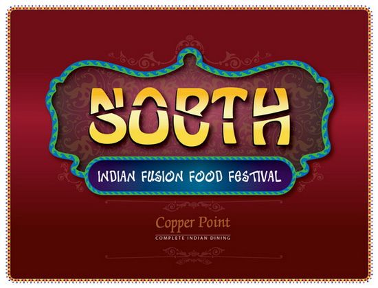
An interesting use of split text allows the makers of this piece to combine two words into one, creating an ad that begs to be further investigated while additional typography gives it a specifically Indian feel. 8. Deep Sea
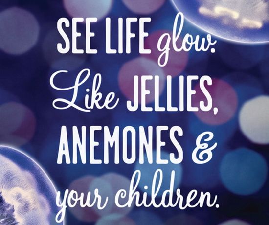
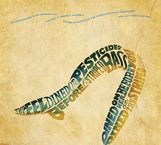
The natural background blends beautifully with the varied typography used in this marketing piece for the Vancouver Aquarium, creating a vibrant and welcoming scene. 9. Oh, Horror!
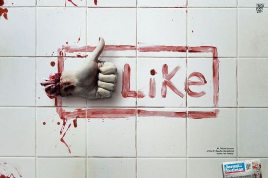
Making clever use of a common social media meme, this ad for a Portuguese horror film festival combines its unique flavor and message with an outline that will be instantly recognized by hundreds of millions of people around the world. 10. Ban Landmines
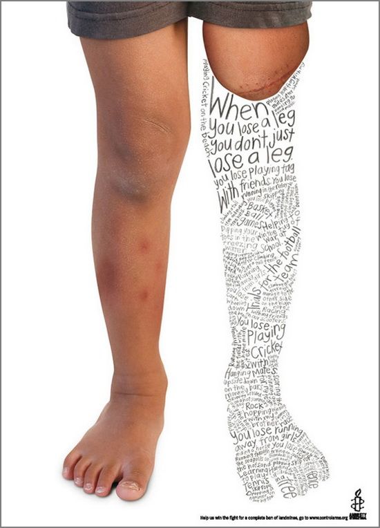
This charitable ad instantly grabs the viewers attention with its stark photographic background and the compressing of childlike text in the outline of a leg. While making for difficult reading, it is compelling in its ability to draw one in for closer and lengthier inspection, helping to further the cause it is championing. 11. Back & Forth Text
The seemingly awkward placement of the text in this ad make for difficult reading at a glance, working to compel viewers to have a closer look and quickly revealing that the text isn’t so difficult to follow, after all! 12. Modern Retro
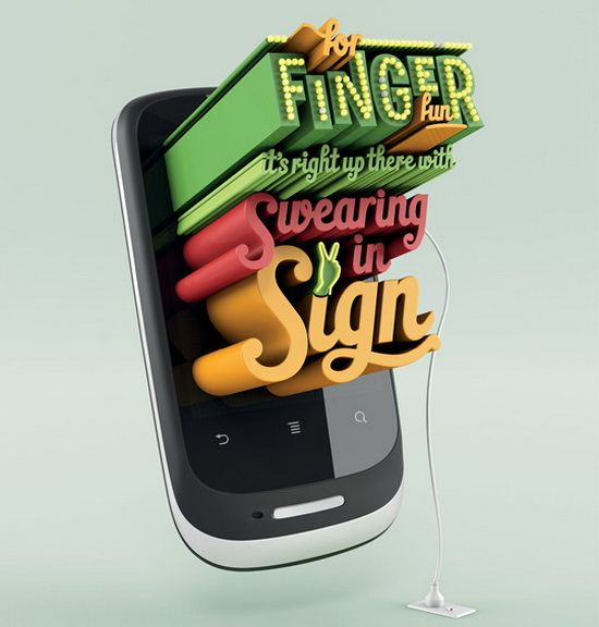
Combining the old fashioned style of retro text and neon lighting with an unmistakably modern smartphone gives this ad from mobile phone maker Huawei the ability to catch the eyes of readers and passers-by while the saucy message does the rest.
Image Credits: 1, 2, 3, 4, 5, 6, 7, 8, 9, 10, 11, 12.
|


| You are subscribed to email updates from Orphicpixel To stop receiving these emails, you may unsubscribe now. | Email delivery powered by Google |
| Google Inc., 20 West Kinzie, Chicago IL USA 60610 | |
Niciun comentariu:
Trimiteți un comentariu